top of page

TOOLS
Pencil & Paper
Figma
DURATION
2 weeks
TEAM
2 UX Designers
The Wood Shop
The Wood Shop is a Tallahassee, Florida-based barbershop that is aiming to be a social impact venture aimed at creating a safe space for the residents of this college town.
ROLE
UX Designer, focused on designing and developing an initial touchpoint website for clients through usability testing and creative collaboration for UI components.
PROBLEM: prospective clients need to be able to learn about the shop in order to feel comfortable booking an appointment.
GOAL
For this project, my task was to design a website for clients to learn more about the barbershop's leadership and values, get an intro to the Wood Shop brand, and book an appointment.
visit the website at:

THE BRAND
Logo

Colors
DISCOVERY
INITIAL CHALLENGES
Not enough time for design and development;
2 weeks...
Website integration information wasn't available
No content or visual assets
No business plan; no company-specific information to inform design decision and overall business strategy
RESEARCH
COMPETITOR ANALYSIS
Researched local barbershops in the Tallahassee area and their sites were comprehensive -- about, meet the barbers, contact us, location/ address, list of prices and services, photo gallery, social media.
ALL barbershops outsourced booking systems.
EGO FOR MEN

Book Online button

Prices and Services
Meet the team
FADED TWIST

MANKIND

Contact us
RAINEY'S BARBERSHOP

Social media
URBAN TRIMS BARBERSHOP

Gallery
DESIGN
Once I understood of what was needed to include into our website for our users, I then started building out wireframes.
The purpose was creating screens that had an easy-to-navigate experience without going on the search, as well as a clean layout for each section of the website.

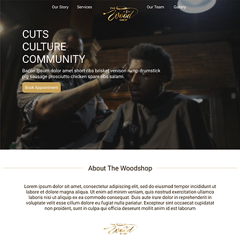
The Wood Shop logo in the left corner for branding. The nav bar includes all of the sections for the website.
'Book Now' button available in top right corner, in case the user doesn't have time to scroll.
Big hero page to welcome and showcase a glimpse of the vibe this shop will represent.
Short blurb from the CEO to make it more welcoming.

A list of services and prices was a must from the research.
TEAM
'Team' section for users to be familiar with the barbers and their work by browsing their social media.

'Gallery' shows off the barbers' work as well as portray the shops brand.
'Contact us' section contains address, location inside the mall, phone number, and their social media.
HI-FIDELITY WIREFRAMES
Using colors of the logo, we branded a color palette that deemed fit for this website.
Also, given the time constraints, I designed a hi-fidelity product to use for our use case scenarios.
I wanted to create an experience where the users interacted with the product and see their natural movements.

Interviewed individuals who currently frequent a barber/ barbershop.
-
4 interviews
-
Ages 25-35
-
Men & Women
TEST
USER INTERVIEWS
Our team was excited to discover what the users looked for in the usability test to see what they like, don't like, what they usually look for when booking for a barber, and what interests are peeked.
For the interviews, we had case scenarios to direct them to looking for particular locations on the site.
Our interview audience fit into the proper demographic for this test.
Interviews
WHAT THEY SAID...
"One stop shop!"
"Great! because you don't see many barbershops doing websites like this!"
"I like to see actual prices for services."
"Looks like a legit barbershop. I'd go there."
"Gallery is too cluttered."
With iterations from the testers, we created a redesign version of the hi-fidelity website.
ORIGINAL HI-FIDELITY

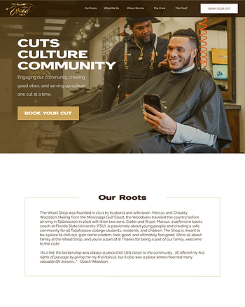
The original hero page, the users liked that it was barbershop themed, but too dark.
"Wording is key!" said one user.
Changed the wording for all sections to make it more engaging and user friendly.
'About The Woodshop' = 'Our Roots'.
FINAL WEBSITE
vs.

Adding another "Book Your Cut" button in the top right corner gave multiple options to users who didn't want to explore the site.
Marcus Woodson, the CEO, wanted to add a bit of him on the site to be relatable to clients.

'Services' section with the hover wasn't direct.
'Our Work' = 'The Proof'
Users' said this image gallery was cluttered.
vs.

Users wanted the service + price on display.
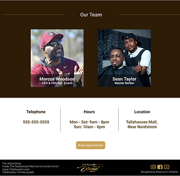
We moved 'Where We Are' to prevent users from skipping and scroll to the bottom for this information.

vs.

'Our Team' = 'The Crew'
Got rid of the "Book Appointment" button since there's 3 other convenient options to make appointments.
Hovering over each crew member, you have access to book appointments directly with the chosen barber.
The photo gallery, 'The Proof' is displayed via carousel for easier view.
CONCLUSION
EXPLORE THE WOODSHOP
With this design and layout, we addressed the users' needs and interests by providing the trust of the brand, learning their values, and having access to services; all the while, easy site navigation and user friendly.

This project taught me how to manage my time in ways I didn't know was possible. Although we didn't have much to work with, let alone an actual company, the research process was smooth. Census data research for the target audience wasn't difficult to get hands on. The user interviews were interesting because I learned of a community that didn't know existed, which put into perspective the different sections for the website.
Through the obstacles we encountered, my partner and I reached a goal that was truly a miracle. Would I do it again? I don't know. But I don't regret it because this project gave me the feeling of true "success". I had the chance to see and get real time reaction from the client and them being so emotional assured me I succeeded.
HOME
bottom of page